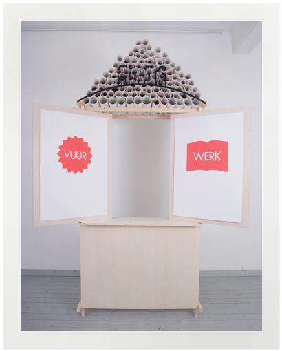
VUURWERK (2012)
As new media is able to produce and quickly distribute imagery around the entire world, it is sometimes important to stop and think about original graphic crafts which seem almost forgotten in today’s society.
When product designer Lara de Greef was asked by Willem II Fabriek to create a project centered around this theme she teamed up with graphic designers Jaron Korvinus, Timon van der Hijden en Yorit Kluitman of De Letterproeftuin. Together they researched the life force of graphic design and came up with an idea for a silkscreen printed poster or calendar which would change according to the seasons. They named it Vuurwerk or Fireworks.
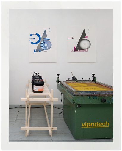
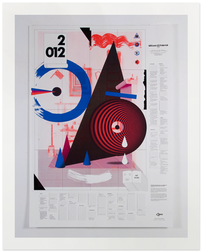
The result is a fun, bright poster which combines product design and graphic design almost seamlessly. The poster shows a photograph of tools typically used in a printing workshop, various layers of graphic imagery and geometrical shapes have been added which in turn form a smiling face.
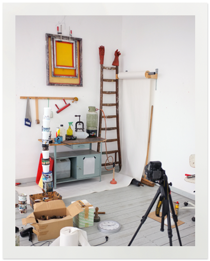
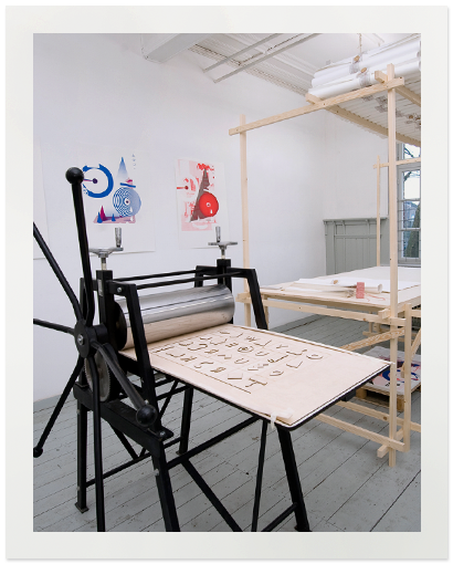
“The design is based on a still-life with tools and materials from the workshop of the graphic atelier,” which was their workplace throughout the project. “Together they form a smiling face. It’s interesting to show the original qualities of old printing techniques at a time when imagery can be produced and distributed at such a fast pace.”
The team created a single design which should somehow change throughout the seasons based on the printing house tradition of producing a free calendars to celebrate a new year and showcase new printing techniques. Because it could reflect the temperature changes of the seasons, thermal ink seemed like a logical fit.
The group approached the European screen ink producer Unico and proposed a sponsorship. Unico agreed to provide different color inks that would alter in transparency and opacity depending on temperature.
The seven-layer design features four layers printed in the specially developed thermochrome ink by Unico. These inks react to differences in temperature and each have a different turning point “which allows the poster to have contrasting imagery all-year-round.”
As an applied product designer, working with a team of graphic designers seemed like a challenge at first for De Greef: “I didn’t know any of the designers beforehand and it can be difficult to unify everyone’s ideas and design ideals. Luckily, the collaboration went surprisingly well and we were able to give each other the creative freedom needed. Each of us has contributed something, which makes it a really well-rounded project.”
Design.nl / By Cassandra Pizzey